 +1 (307) 213 9175
In the ever-evolving digital landscape, creating a website with a stunning User Interface (UI) and an exceptional User Experience (UX) is not just a matter of aesthetics; it’s a necessity. A responsive UI/UX design is the cornerstone of a successful online presence, as it directly impacts user engagement, retention, and conversion rates. In this comprehensive guide, we delve into the intricate world of responsive UI/UX design to help you outrank competitors and craft a digital masterpiece that captivates your audience.
Understanding Responsive Design
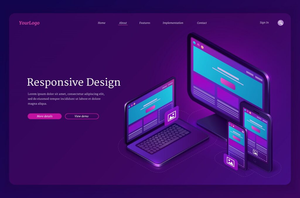
What is Responsive UI/UX Design?
Responsive UI/UX Design is a methodology that aims to ensure a seamless and consistent user experience across various devices and screen sizes. It’s all about making your website adapt gracefully to different resolutions, from the widescreen of a desktop monitor to the smaller real estate of a mobile phone.
The Significance of Responsive Design
Enhancing User Experience
One of the primary reasons responsive design matters is its profound impact on user experience. When a website is responsive, users can effortlessly navigate and interact with it, regardless of the device they’re using. This results in lower bounce rates and higher user satisfaction.
Mobile-Friendly Equals SEO-Friendly
Google, the search engine giant, favors mobile-friendly websites. In fact, mobile-friendliness is a ranking factor, and search engines prioritize responsive websites over non-responsive ones. Thus, embracing responsive design is crucial to boost your website’s visibility in search engine results.
Key Principles of Responsive UI/UX Design
1. Fluid Grid Layouts
The foundation of responsive design lies in fluid grid layouts. These grids allow the content to automatically adapt to the screen size. Whether it’s a three-column layout on a desktop or a single-column layout on a smartphone, the content flows seamlessly.
2. Flexible Images and Media
Responsive design entails using images and media that can resize proportionally. This prevents images from being cut off or overflowing on smaller screens. It ensures that your visuals remain visually appealing, regardless of the device.
3. Media Queries
Media queries are CSS techniques that enable you to apply different styles based on the user’s device characteristics. They allow you to tailor the design, fonts, and spacing for specific screen sizes, ensuring optimal readability and aesthetics.
4. Mobile-First Approach
In today’s mobile-centric world, adopting a mobile-first approach is imperative. Start designing for mobile devices and gradually enhance the layout for larger screens. This ensures that your website is well-optimized for the majority of users.
Best Practices for Responsive UI/UX Design
1. Prioritize Content
On smaller screens, prioritize the most important content to provide a concise and focused user experience. This ensures that users quickly find the information they seek without unnecessary scrolling.
2. Touch-Friendly Navigation
For devices with mobile capabilities Choose a navigation that is touch-friendly elements, such as bigger buttons as well as simple gestures. This helps users navigate more easily and helps reduce frustration.
3. Performance Optimization
Responsive design must not hinder website speed. Improve images and reduce HTTP request, as well as utilize browser caching to speed up loading on all devices.
4. Testing and Iteration
Regularly test your website on various devices and screen sizes to identify and address any issues. Responsive design is an ongoing process that requires continuous refinement.
Tools for Responsive Design
1. Bootstrap
Bootstrap is a popular front-end framework that provides a robust set of tools for building responsive websites. It offers pre-designed components and a responsive grid system, simplifying the development process.
2. Adobe XD
Adobe XD is a powerful design and prototyping tool that allows you to create interactive prototypes for responsive websites. It facilitates collaboration between designers and developers, streamlining the design process.
Conclusion
In the competitive digital landscape, responsive UI/UX design is not an option; it’s a necessity. It enhances user experience, boosts SEO rankings, and ensures your website’s accessibility across devices. By embracing the key principles and best practices outlined in this comprehensive guide, you can craft a website that not only outranks competitors but also leaves a lasting impression on your audience.